by simplyzesty.com
No matter what happens, there will always be a demand for data visualization tools. Data on its own can be pretty boring and brightening it up with images and other visual tools, it can make normally inaccessible information much easier to digest. (Editor’s Note: It’s also great for information reading literacy, and the new Common Core demand for multimedia “texts.”)
There are a number of fantastic tools out there that will present your data in an accessible manner. All of the tools listed below are free and chances are you’ve used one or two of the tools mentioned before.
1. LinkedIn Maps
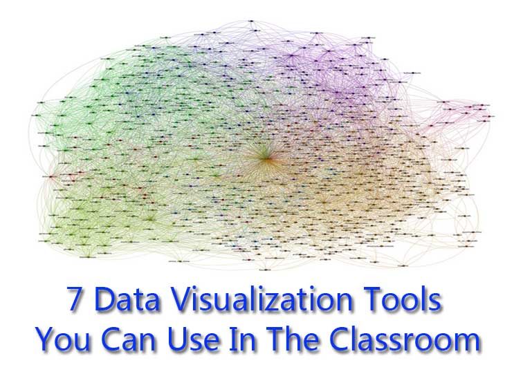
Considering the nature of LinkedIn, this is an incredibly handy tool to have if you want to identify what areas you’re influential in and see how tight your connections are. The information displayed is rather simple, LinkedIn’s app will color code your connections, based on their links with mutual connections, and bring them together for you to identify different professional networks.
When your map is created, you can give each cluster a label, although you will want to make them general since there are only five colours and not everyone in a cluster will fit neatly into the labels you give. However, despite that flaw, LinkedIn Maps is a great way of seeing how professional network connect.
2. Google Ripples
A feature that Google+ introduced early on in its lifespan. It’s surprising that the other social networks haven’t offered something similar, considering how useful this feature is to marketers and page managers. For those unaware of what it is, Ripples visualizes the virility of any post on the site by mapping who shared it and how it spread. It’s done in a visually appealing way and the inclusion of a ‘play’ feature shows you how exactly this process happened.
On its own, the use of Google Ripples is somewhat limited, but with Google planning to introduce a dedicated analytics section for business pages soon, Ripples will grow in importance. A summary of all shared posts, a way to identify influential followers and how they’re interacting with (content) would be features we would look for, but as long as it’s robust, page owners won’t be complaining.
3. Facebook Profile (Wolfram Alpha)
A feature Wolfram Alpha introduced back in September, Wolfram Alpha’s Facebook report delves into your profile and breaks down all of your activity into easy to digest graphs. It’s surprisingly comprehensive so data like times of interaction, word maps, relationship stats and network structure is all visualized for your convenience.
This is mostly for fun since it’s only your personal account that’s visualized, but if Facebook is your main source of interaction (with subscribers, friends, etc.), you will have a lot of information to help you improve.
4. Facebook Insights (Excel)
While you will have to do most of the work yourself, there is a very handy way of using Excel to visualize your Facebook page data and help you spot trends. While Facebook Insights covers the basics, there are alternative ways of looking at this data. For one, you can export all the data from it to an Excel file, allowing you to mess around and process the data in a different way. You can either get the data for page level or posts and can select any date range, with a maximum of 500 posts a day.
While visualizing the data will require the user to put some work in first, it will allow you to spot medium- and long-term trends with engagement and user interaction and help you plan your social media strategy.
On a related note, Excel is a handy way of visualising any type of data and is more diverse than you would initially assume. It’s limited in terms of graphics, but it’s superior to other similar products like Google Drive.
5. Google Chart Tools
Google’s own data visualization tools allows users to create dynamic charts and place them on your site for people to admire. It’s essentially similar to how Excel would work, but instead you code the graphs onto your site. Depending on the data, you can display pie charts, graphs, dashboards and tree maps to help get the message out there. The other flaw behind it is that the scope for customization is limited. However, if you’re not bothered by this, you will find a lot to like here.
6. Visual.ly
Focusing on the creation of info graphics when it first launched, Visual.ly is one of the more popular infographic and data visualization tools out there. While the trend of companies using infographics is on the wane (a good trend in our opinion), it’s useful for creating one-off visualizations. Simply pick a template, connect it to your Facebook or Twitter account and get a custom graphic containing your account’s data back.
Of course, there is also the ability to create custom versions, but like Google Chart, the type of visualisations you can create are limited. However, if you’re looking for something more colourful, it’s worth looking at.
7. Leaflet
If mapping is more your thing, then Leaflet is the tool you’re looking for. Designed by Vladimir Agafonkin of CloudMade, Leaflet uses OpenStreetMap and is designed to be both desktop and mobile-friendly. The real strength of this tool lies within the many plugins you can install, allowing you to add heat maps, layers, extra controls and visuals to improve your map.
This is a cross-post from simplyzesty.com Image attribution flickr user speedoflife